

“Mere color, unspoiled by meaning, and unallied with definite form, can speak to the soul in a thousand different ways.” ~oscar wilde
~~~~~~~
I love color, and I love the absence of color even more. I like in particular their juxtaposition. Since I’m around color so much every day, designing gowns that are deep reds and eggplant, royal blues, emerald green, sometimes collections around different shades of pink, or hues of yellow… I just want to disappear into blackness, deep grays, the darkest navy. My work overwhelms me, and so slipping away into shades of neutrals, textured and layered is my calm, my balance. But this hasn’t always been so… I grew up in love of brightness, fluorescence, and using the power of color in roller-skating competitions, for judges to remember me both by how I performed but more particularly by what I wore ~ vermillion reds with bright whites, deep oranges, sunflower yellows, saffrons, rusts. And now, watching my daughter Royal transform when she feels confident wearing fuchsia, polka-dotted peach, royal blue, startling white, and then when she wants to disappear in grey sweats, black tanks, bulky hoodies. In her I see myself, and realize the potency of emotion that color can communicate, how it can both translate but more importantly transform how one feels.


Above, collage ~ “Shedding Skins” gowns from my first show, 2001. Havana 2005, photo Jock McDonald. Chez Panisse Collection 2011, photo Gabriel Harber. Barbie Collection for the film SAFFRON, directed by Jeff Ingram and Stuart Locklear. Collaboration with Jake Wall, Photo Kelly Puleio.


Above, from left ~ Royal and I at the Academy of Art Runway Show, 2007. At the Red Cross Gala, 2009. Modeling the “Royal” Collection. Graduation 2014.


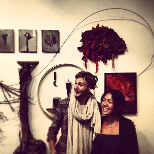
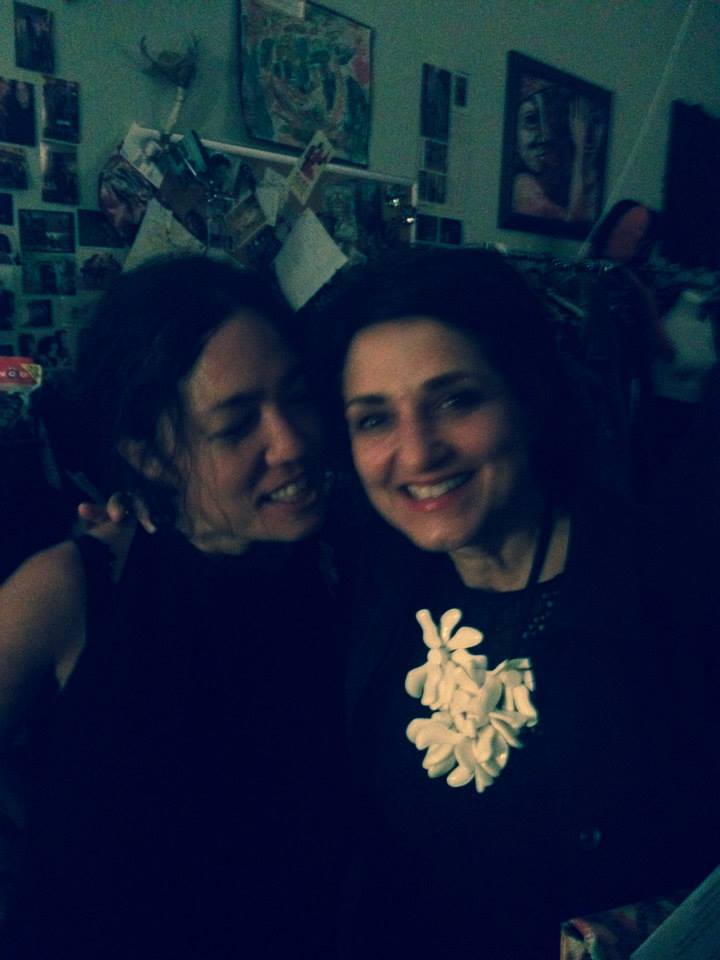
Above ~ one of my favorite roller-skating outfits. Me in a classic asymmetric black matter jersey dress with my models, Black V 2011.
~~~~~~~
“Colors, like features, follow the changes of the emotions.” ~ Pablo Picasso
But the question is not only how color makes us feel when we wear it, because that has more to do with our body, but more so how we feel surrounded by it, in the spaces we inhabit.. How can it transform our experience? It’s like light to me. When I lived abroad in England I felt a heavy weight that just happened over time, because of the absence of sunlight, the experience of sameness. So i embraced the darkness, the evenings. But when I would travel to the continent, and the sun would emerge, and everything would brighten, the light and color was transformative. It made me happy. There was this profound feeling of possibility. I felt like I could do anything.
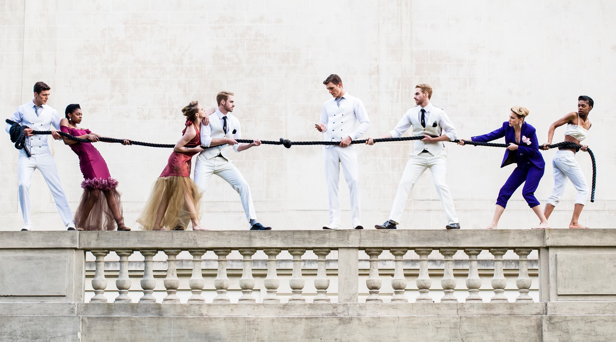
So color is about context. Last night after a late-night steak-frites at Chez Panisse and late-late night drinks at Prize Fighter, I was talking with my collaborator Jake Wall, with whom I create an annual collection for the Human Rights Campaign “Suit Up for Equality” runway show and I asked him about how color has inspired him. He looked at me and said emphatically “Life is better in technicolor!… There’s a whole time period in the history of movies where there was this vivid over the top color… My Fair Lady, the original Willy Wonka, and my favorite was Singing in the Rain which I finally saw at Cal because it was my mid-term film… the world of technicolor is all about over the top, like think about The Wizard of Oz.. Color for me and my work is coming from an evolution of how I talk to people. So the new collection we’re showing on the runway next month is all red, white and black. White and Black are zero value color and red by definition is right in the middle and used usually as an accent color. It goes with everything. But red also has an opinion! So it feels right to make a collection of colors that are traditionally used as finishing details and make them stars. So color can be increasingly powerful depending on the surroundings, the composition, the juxtaposition!”
Above ~ a “preview” of the collection to be shown on the runway at McCroskey’s August 14th. Photo by Kelly Puleio.
~~~~~
color ~ environment ~ juxtaposition ~ power ~ transformation ~ possibility
I met Laura Guido-Clark years ago and would get emails over the years about her work with color in urban communities. Then my friend Hope Bryson sent me information to participate in a project Laura was doing with Fouladi Projects in SF called “Art for HUEmanity” ~ to benefit her non-profit Project Color Corps. Laura literally transforms inner city neighbors and the experiences the inhabitants have in them through the use of color and texture. And her vision of Project Color Corps is just that ~ a color revolution ~ “how color and pattern can impart positive messages of optimism and hope in urban neighborhoods.” We sat down in her studio in Berkeley and talked about those transformative moments in her background that got her to where she is now, as a color and design consultant for companies like American Girl, Apple, DWR, Mattel, Herman Miller, Samsung, HBF and Toyota. But when I think of Laura I think of her passion for changing the feel of a space or an environment by using color as a tool to give hope, inspire children, and show possibility. And the money she raises from this collaborative show directly funds the re-imagining of the urban neighborhoods she’s working with ~ using color as the medium for transformation…

Above, left ~ My “Venetian Red” textile sculpture for Laura’s “Art for HUEmanity” at Fouladi Projects in SF. Right ~ a commissioned textile sculpture (that evokes the taste and texture of cabernet sauvignon) for Stone Street Wines Tasting Room in Healdsburg; with my friend Guillaume Lafarge.
~~~~~~~
Laura Guido-Clark, Interview #19 at her Berkeley Studio, March 26th 2014
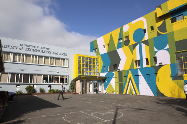
Project Color Corps for E.C. Reems Academy ~ “We are the change”
On color ~ “I’ve always thought about it as a language. it precedes words. Research reveals people make a subconscious judgment about a person, environment, or product within 90 seconds of initial viewing and that between 62% and 90% of that assessment is based on color alone. We make a judgement within 90 seconds, and much of it is on color alone…So, what colors do you want to see? This is why people want to paint so much. It changes everything. I love the materiality of it ~ ceramic and matte, and I love to play with the relationships of color. It’s fascinating. It’s such a beautiful medium. It’s scientific, soulful, emotional. It’s so multidimensional that you realize it’s with great humbleness that you approach the medium ~ light, refraction, it’s just crazy..
My non-profit is a great equalizer. everyone deserves a beautiful surrounding. it’s like breathing; if you don’t see this inner beauty (through being in a beautiful environment) it’s hard to rise and feel hopeful. This is the medium and tool that can do that. It’s so easy it’s a can of paint. It’s pigment. And I love what color does across different mediums ~ the nuance of all of those and how it changes your perspective…
On teaching color and perception ~ “There is an exercise I did when teaching with Beverly Thome. We asked people to pick there least favorite color and most favorite and then they pick one color that makes the two of them work together. and you realize color is contextual. it’s a relationship. it changed and shifted their relationship. it’s this eureka moment. Another exercise, is one time these little kids came in, and I got an idea of their personalities. We talked about the tooth fairy and then I said, pick the color you think is most like you and put it on your forehead. The most introverted kids picked neon, and the more extroverted picked subdued colors. What was amazing was the way a color could speak for them in an interesting way. I knew what was on the inside and that was great~
On the path to NOW ~ “There have been these quintessential moments when I understood I was led on a path and I’ve had several of them. #1 ~ when I saw THE WIZARD OF OZ it changed everything. I was 10 years old, and what happened at that moment when it went from black and white to color ~ it was the most life altering thing. It was a journey that changed everything. #2 ~ my nonna had an all silver tree, and I remember her saying the tree was so beautiful and thinking my nonna was right. The colors that were changing the tree from the gel (which cast colored light over a 60s era silver tree). I was mesmerized by that experience. #3 ~ I was in Dearborn, Michigan and the thing I noticed most was the car colors, because Detroit was the mecca…In college, at Wayne State University, in Detroit I had a double major of interior design and pre-med. I wanted to be a doctor or a designer and I had an a-ha moment when I realized the thought process I loved, and that it was similar to pre-med but design. I was giving myself permission to do something I loved. I got up in the middle of an experiment and I was so clear that I wanted to do something else.
On projects ~ “I collaborated on a bedding collection for DWR with Karen John who is now a very close friend. We started to think about what the bed meant. It was the new social room and had many social scenes. It was a room in and of itself and what happened on that bed changed throughout the day. There was such beauty in this one particular piece of furniture. It wasn’t about adornment but in the experience of it, and the experience of sleep. The color of it, the feel we brought to it through linens and cottons. We also did pillow covers so there was this crispness but also softness. I get to think differently and do deep dives into things.


Above, left ~ Laura’s HBF Fabrics/Warm and Glowing Palette. Right ~ my gowns on models Helena Martin and Mellissa Gray, in mid-air jumping on a McCroskey mattress, shot on location by Kelly Puleio at the McCroskey Mattress Factory, SF where we do the HRC runway show annually (this year August 14th 2014) with Artful Gentleman’s Jake Wall.
~~~~~
“…Whether it’s electronics, automotives, toothbrushes ~ it’s a new way of having to shift perception into this other world. ” With American Girl I had to ask what is an american girl? how do girls see themselves because all girls see themselves in her. What would the depth of a real girl be, and how to say that through a palette of color… I am also the Creative Director for Materials Innovation for Herman Miller. It is an honor to work with a company that is so dedicated to design. They are humble in their mission statement. They design to enable people to do great things….and they always do it soulfully.”


Above, left ~ Chairs, Emeco + Coca Cola/Nature based palette. Center ~ Pablo Lighting /Crisp and Clean Color.
Right ~ Heartwork cabinet /Sunny and Optimistic.
~~~~~
On food and wine ~ “I was raised in an italian family and we always had gardens and we ate fresh beautiful food all the time. i remember my grandfather’s garden. he took so much pride in it. the rows of lettuce and shades of green…We always had so many gathering, always around food. i love wine. pinot. something about pinot that really speaks to me but i don’t know why. and with food there’s something that speaks to me texturally.”
On clothes ~ “I organize everything by color.. one section is all black. but the older i get, the more into color i get.. wearing green on a certain day to to reflect my day…I’m a big fan of maison martin marginal, but i only own one piece. i used to love romeo gigli.. he had very subtle beautiful colors that you could layer together. i’m a big miuccia prada fan and the playfulness of Marni, i also like philip lim, the more refined pieces. i love runway and seeing the new collections and materials. i love the way people play with layering of materials and think it’s fun. fashion is fun. i can be playful, but i like the subtleties of color better…
On FILM ~ “Pleasantville ~ and how you were in black and white until you had enough conviction to be you, and then you became color. You had to be so brave to stand up for who you were. Also, American Beauty ~ the red in those petals and the scene with the bag when he says “there’s so much beauty in the world.”
~~~~~
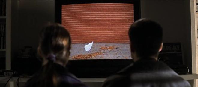
“Do you want to see the most beautiful thing I’ve ever filmed? It was one of those days when it’s a minute away from snowing, and there’s this electricity in the air, you can almost hear it. And this bag was just, dancing with me, like a little kid beggin’ me to play with it – for fifteen minutes. And that’s the day I realized that there was this entire life behind things, and this incredibly benevolent force that wanted me to know that there was no reason to be afraid, ever. Video’s a poor excuse, I know. But it helps me remember – I need to remember. Sometimes, there’s so much beauty in the world – I feel like I can’t take it, like my heart is just going to cave in.” ~ American Beauty
On the salon dinners ~ “The whole purpose is the connectedness. That’s the story. It’s how you live your life. It’s a vision. You move in beautiful circles and they intertwine, and very few people can get up above and connect the dots. You’re the conduit who brings all those people together ~ the dialogue and sensuality of it at your studio. I sat near sandro and I thought I always liked this man, and now I love this man. And I discovered that at your place. I remember the salad, the color of those radishes and thought “now this is perfection.” And that was with respect to your studio, but now the interviews ~ it’s a sacred space. It’s a world that we’re entering. There’s intimacy. There’s a beauty in putting yourself out there and saying “here I am.” You have this passionate desire to bring people together. But there’s also a beauty in TIME ~ a willingness to dig deeper and share things that are more intimate. I’m a big believer in physics and potential. As you see it, you live it. We all see differently. You see contexts and interconnections. When you change the pattern and let things go, that’s when things happen. That’s why I like collaborations so much. I like people’s energy and bringing the best to the table. You bring your best and then let it be.”
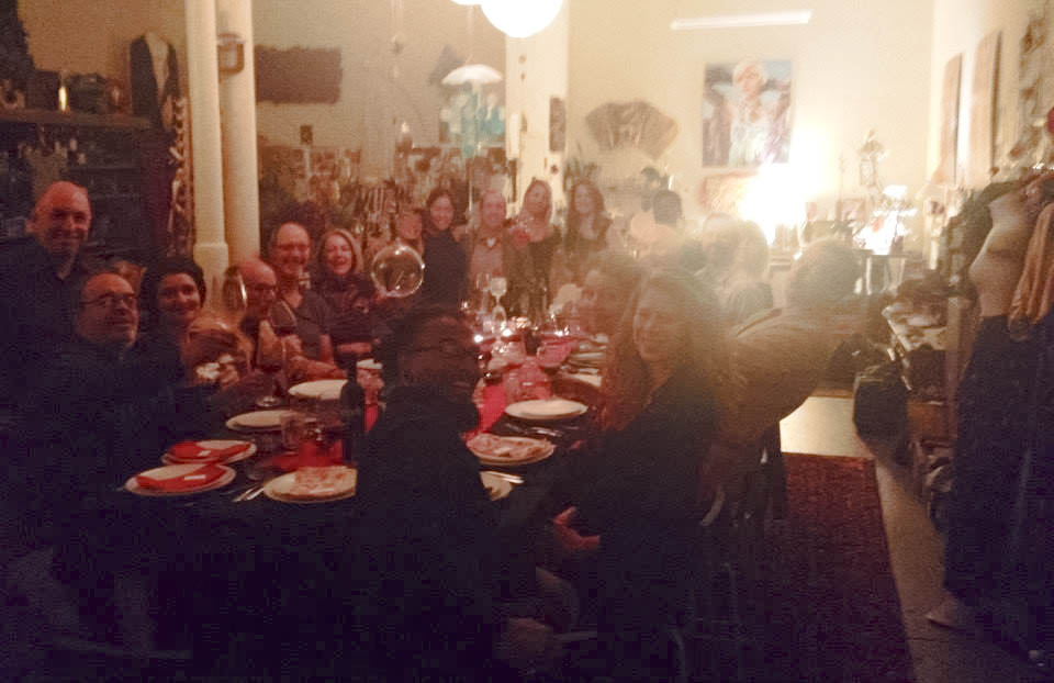
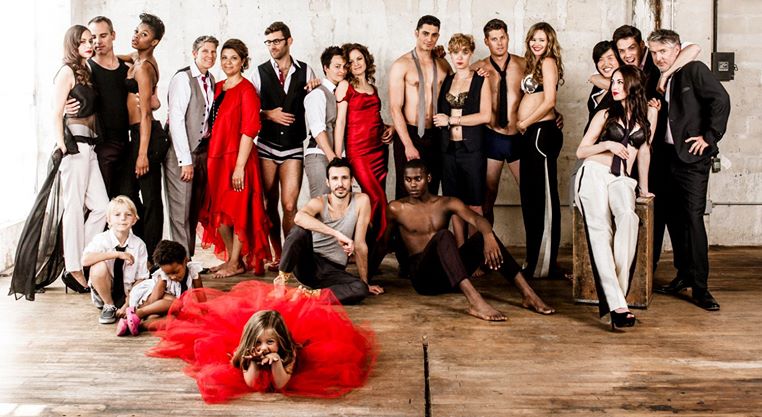
Above ~ Salon #32, with guests angelo garro, joe, sandro rossi, pack prieto, jenny rankin, wellington dong, myself, chad arnold, eve love, lloyd bernberg, susanne kauer, richard hylton, anya fernaild, mani niall, lloyd bernberg, renato sardo, sara o’malley, hope bryson and royal, nora, august…
 TEA: juicy
DRINK: slurp
WEAR: layers
LOVE: deeply
REMEMBER: everything
DO: good
BE: you
WATCH: intently
SEE: all
SWEAR: OY
~~~~~
““The only people for me are the mad ones, the ones who are mad to live, mad to talk, mad to be saved, desirous of everything at the same time, the ones who never yawn or say a commonplace thing, but burn, burn, burn, like fabulous yellow roman candles exploding like spiders across the stars and in the middle you see the blue centerlight pop and everybody goes “Awww!” ~ jack kerouac


Nitin Balodi
What a thorough post and the personal examples those are cited by you are really great. One can do miracles if s/he knows the facts and psychology that is hidden behind every color.
-Niitiin